Design elements
The Kentico brand reflects our Mentor archetype: wise, approachable, and forward-thinking. Our visual identity highlights close relationships with clients and partners, expressing our human-first values through thoughtful design.
We’ve evolved our brand to better match this philosophy.
Round corners
- Small radius
Used for micro-elements (checkboxes, inputs) to soften edges without taking up space. - Button & form radius
Use a 24px radius for buttons, badges, and form fields—rounded, but efficient in layout. - Card & image radius
Use a 40px radius for cards, images, and banners. These elements should never touch the screen edges.

Shapes
We use basic shapes with soft curves to build compositions that feel fluid, intuitive, and human.

Shape compositions
We build layouts by combining layered shapes in asymmetrical, modular ways. These compositions reflect our flexible approach to digital transformation—never rigid, always dynamic.

Illustrated people - DEPRECATED
Previously, we used illustrated characters to express complex digital ideas. These have now been retired in favor of more authentic visual storytelling.

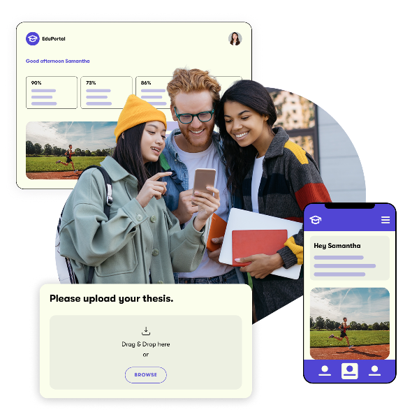
Real photo collages
We now use real photographic collages featuring people in authentic settings, paired with Kentico shapes and brand colors. This shift better reflects the warmth and relatability of our brand.
These collages are:
- Based on real photography
- Feature diverse, natural moments
- Combined with Kentico design elements
If you need guidance or assets, contact [email protected].


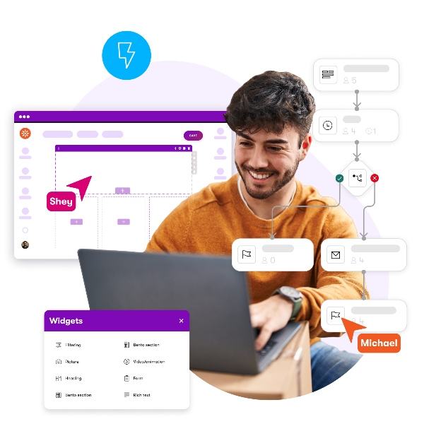
Icons and Micro Illustrations
We continue to use 24x24 px icons in infographics and UI components. Icon colors may vary depending on context but must stay on-brand.
Need something custom? Contact [email protected].

Did you not find what you needed?
Are you missing an icon or micro illustration that would appropriately represent important information? Do not hesitate to contact the graphic team at [email protected].