Logotype
We updated the logotype of our "new" Kentico. Previously the flower was in an orange square but we've decided to switch to circle to highlight the "togetherness" that twines around the heart of Kentico.
Whether you are referring to Kentico, the company, Kentico Xperience 13, Xperience by Kentico or any other product, please use only the Kentico logo below.
How to use
Place the logo in the top left-hand corner.
Vertical variant
The Vertical Logo is used in small applications where you need to save space (e.g., a small banner). The minimum size should not be any smaller than 48 px in height. Please consult the usage of this version with the Graphics Guild at [email protected].
Sizes
The minimum size of the Kentico logotype is 118 × 40 pixels.
Safe zone
Please make sure you leave enough space around the logotype at least the height of the letter "K".
Spacing & Placement
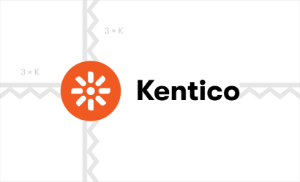
Shortcut variant
The shortcut is used in small applications where the word Kentico occurs somewhere close to the shortcut (e.g., a Facebook icon, Windows icon, Thumbnails, Favicon, ...). This includes situations when the whole logo would be too small when fitted into the given space or when the artistic intention or technology requires the simplest possible logo option. The minimum size should not be any smaller than 16 px in width. We prefer using shortcut with a square background, but when it situation requires circle background, coud be this versin used as well.
DOs & DON'Ts
Place the logo in the top left-hand corner.

Do
Use the monochrome white logo on a dark-colored background.
Do
Use the monochrome black logo on a light-colored background.

Do
Use the monochrome white logo on an orange background.
Do
Use the monochrome black logo on an orange background only in case if it not applicable preferred white monochrome logotype on orange background.
Do
Use Kentico logotype above the image.
Do
Use Kentico logotype above the image. Be careful if it's the image under logotype isn't too light.

Do
Use Kentico logotype above the image.

Do
Use Kentico logotype white version above the image.
Do
Use Kentico logotype black version above the image.
Do
Use Kentico logotype white version above the image. Be careful if it's the image under logotype isn't too light.
Do not
Use the Kentico logotype on a dark-colored background.
Do not
Use the monochrome white logotype on a light background.

Do not
Separate, or move the circles.
Do not
Stretch or scale logo disproportionately.
Do not
Change the position of the logotype elements.
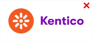
Do not
Change the color of the text.
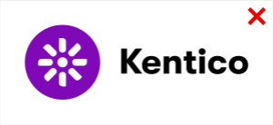
Do not
Change the color of the circles to a different one.
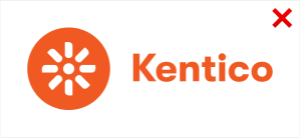
Do not
Use Kentico Orange on text part.
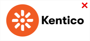
Do not
Scale up circle with petals without scaling the text.
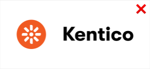
Do not
Scale down square with petals without scaling the text.
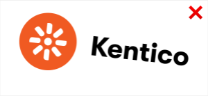
Do not
Rotate the logotype.
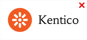
Do not
Change the font in the logotype.
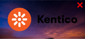
Do not
Use main logotype on dark image
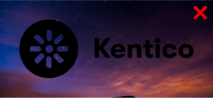
Do not
Kentico logotype black version on dark image.
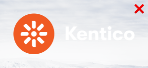
Do not
Kentico logotype on the too light image.
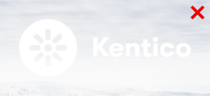
Do not
Kentico logotype white version on the too light image.

Do not
Place content of image under the Kentico logotype.
Depricated
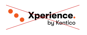
Do not
Please do not use this logo. Xperience by Kentico does not have its own logo. When referring to Xperience by Kentico, use the Kentico logo.